Typography Task 1: Type Expression

22 April 2024- 3 May 2024
CHONG CHENG TAO (0371072)
Typography | Bachelor of Design in Creative Media | Taylor's University
Task 1: Exercise 1 & 2

List
LECTURES
Week 1:Typo_0_Introduction
In the video, Mr Vinod elaborated the important of typography to a visual
designer/artist. Typography can be seen in our daily life. Typography is the
art and technique of arranging typr to make written language legible,
readable, and appealing when displayed.
What typography is?
1) Act of creating letter
2) Animation: Movie title & Gif animation
3) Website design
4) App design
5) Signage design
6) Labels, books and poster design
7) Logo types
Typography has evoled over 500 years which is from calligraphy >
lettering > typography.
Difference between calligraphy and lettering
Calligraphy: Letter is written out.
Lettering: Letter is drew out.

Fig 1.1 Example for calligraphy
Two terminologies is delivered by Mr Vinod which are font and
typeface.
Font: a font refers to the individual font or weight within the
typeface, I.e,: Georgia Regular,
Georgia Italic and
Georgia Bold.

Fig 1.2 Font
Typeface: it refers to the entire family of fonts/weights that
share similar characteristics.

Fig 1.3 Typrface
Typo_1 Development
1) Early letterform development: Phoenician to Roman
In the past, writing meant scratching into wet clay with sharpened stick or
carving into stone with a chisel.Later, uppercase letterforms are evolved to
the combination of straight lines and pieces of circles.

Fig 1.4 Phoenicians votive stele Carthage

Fig 1.5 Evolution from Phoenician letters
Phoenicians (Semetic) peoples wrote from right to left. In the other hand,
the Greeks developed a style of writing called 'boustrophedon'.The
lines of text read alternately from right to left and left and right.
Simultaneously, the orientation of the letterforms changed too.

Fig 1.6 Boustrophedon

Fig 1.7 Timeline of letter development
2) Hand script from 3rd- 10th centery C.E.
Square capitals: Written version in Roman monuments which have serif
added to the finish of main strokes.

Fig 1.8 Square capitals
Rustic capitals: These capitals allowed twice as many word on a sheet
and can be written faster compare to square capitals. However, they are
harder to read.

Fig 1.9 Rustic capitals
Both capitals were reserved for documents of some intended
performance.
Lowercase letterforms were developed for everyday transactions for speed

Fig 1.10 Development of lowercase letterforms
Uncials were found in Roman cursive hand escpecially in the shape of the
A, D, E, H, M, U and Q.

Fig 1.11 Uncials
Half-uncials mark the formal beginning of lowercase letterforms, replete
with ascenders and descenders, 2000 years after the origin of the
Pheonician alphabet.

Fig 1.12 Half-Uncials
All ecclesiastical texts are standardize by Charlemagne.
Majuscules(uppercase), miniscule, capitalization and punctuation are
used to set the standard calligraphy for a centery.

Fig 1.13 Caloline miniscule
With the dissolution of Charlemagne's empire, Blackletter was gained
popularity in the northern europe
Guternberg introduced brass matrix, or negative impression, for each
letterform.


4) Text Type Classification
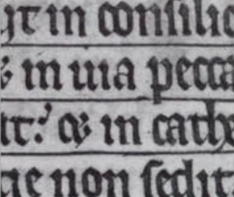
Fig 1.14 Blackletter Textura


Fig 1.15 & Fig 1.16 Timeline of other types development

Fig 1.17 1450 Blackletter

Fig 1.18 1475 Oldstyle

Fig 1.19 1500 Itatic

Fig 1.20 1550 Script

Fig 1.21 1750 Transitional

Fig 1.22 1775 Modern

Fig 1.23 1825 Square Serif
Fig 1.24 1900 Sans Serif

Fig 1.25 1990 Serif/Sans Serif
Week 2:
Typo_3_Text_P1
Kerning refers to the automatic adjustment of space between letters, is it
often mistakenly referred as letterspacing.
Letterspacing is the addition of space between letters
Tracking is the addtion and removal of space in a word or sentence.

Fig 1.2.1 Words with & without kerning
In headline, if a letter is used in all uppercase, kerning is often used
to add more space. It would make the uppercase words look more
presentable.

Fig 1.2.2 Kerning of uppercase letters
As letterspacing is increased, the readability of words will decreased.
This is because people recognize words by shapes and patterns. In
typography, letterform and counterform between the strokes are
important.
Uppercase letterforms are designed to be able to stand on their own, while
lowercase letterforms require the counterform created between letters
to maintain the line of reading.

Fig 1.2.3 Normal, tight and loose tracking

Fig 1.2.4 Comparison between normal tracking & loose tracking
Flush left:
This format most closely mirrors the asymmetrical experience of
handwriting. Each line starts at the same point but ends wherever the last
word on the line ends. Space between words are consistent throughtout the
text.
Flush left will result in ragged right. Thus, it is important to ensure the
ragged right is smooth.

Fig 1.2.5 Flush left
Centered:
This format imposes symmetry upon the text, assigning equal value and
weight to both ends of any lien. It tranforms fields of text into
shapes, which adding a pictorial quality to the text.
Centered text should be used sparingly for small amounts of text due to
its difficulty to read

Fig 1.2.6 Centered
Flush right:
This format places emphasis on the end of a line as opposed to its
start.
It can be useful in situations like captions. The ragging need to be smooth
too.

Fig 1.2.7 Flush right
This fornat imposes a symmetrical shape on the text. It is achieved by
expanding or reducing spaces between words and letters.
The resulting oppenness of lines can occasionally produce "rivers". Thus,
line breaks and hyphenation is required to amend this problem

Fig 1.2.7 Justified
The principle of typography is clean. Generally, text need to be more
conspicuous than type.
Type that calls attention to itself before the reader can get to the actual
words is simply interference. It need to be avoided.
3) Text / Texture
Different typeface suit different messages. For example, Generous x-height
or heavy stroke width produces a darker mass than smaller x-height or
lighter stroke.

Fig 1.2.8 Typeface structure
4) Text / Leading and Line Length
The goal in setting text type is to allow for easy, prolonged reading. At
the same time, a field of type should occupy the page as much as
photograph does.
Type size: Text type should be large enough to be read easily at arms
length.
Leading: Tightly set of text encourages verticle eye movement, which let a
reader loose his or her place easily.
Line Length: Shorter lines require less leading: longer lines mroe. Thus,
a good rule of thumb is to keep line length between 55-65 characters.

Fig 1.2.9 Bad examples of leading
5) Text / Type Specimen Book
Type specimen book provides an accurate reference for type, type size,
type leading, type line length etc.

Fig 1.2.10 Sample type specimen sheet
Compositional requirement: Text should create a field that can occupy a
page or a screen
It is often to enlarge type to 400% on the screen to get a clear sense of
the relationship between descenders on one line and ascenders on the line
below.
Week 3
Typo_4_Text_Part 2
1) Text/ Indicating Paragraphy
a. Pilcrow (¶)

Fig 1.3.1 Pilcrow (¶)
b. Line spacing (leading)
If a typeface is 10pt, the leading is usually 12 pt/12.5 pt/13 pt (2pt-3pt
larger than the typeface). The line spacing and leading should be same to
main cross alignment.
Cross alignment: When there is 2 columns of text sitting next to each
other and the text lines is aligned.

Fig 1.3.2 Line spacing (leading)
Different between line space & leading:
- Leading is the space between two sentences.
- Line spacing is the space between the base line to the other descender.

Fig 1.3.3 Different between line spacing and leading
c. Standard indentation
The indent is the same size of the line spacing or the same as the point
size of the text.
When using indentation, left alignment/ flush left should not be used
(no ragging in the right)

Fig 1.3.4 Standard indentation
d. Extended paragraphs
This method creates usually wide columns of text. It is choosen for strong
compositional or functional reasons like academic writing.

Fig 1.3.5 Extended paragraphs
2) Text/ Widows and Orphans
Widows and orphans are the two gaffes a designer should never make.
Widows is short line of type left alone at the end of a column of
text.
Orphans is a short line of type left alone at the start of new
column.

Fig 1.3.6 Widows and Orphans
In justified text both widows and orphans are considered serious gaffes.
Flush right and ragged left text is more forgiving towards widows, but
only a bit. Orphans remain unpardonable.
The solution to widows is to rebreak the line endings through out
paragraph by using false line break. Next, adjustment of letterspacing
and kerning, but it is restricted to ± 3
(in Adobe Illustrator and Adobe InDesign). So that the last line of any paragraph is not noticeably short.
Careful typographers make sure that no column of text starts with the
last line of the preceding paragraph, to avoid orphans. It can be
solved by reducing the lines of the column.
There is a few ways for highlighting:
- Change to Italic.
- Increase the boldness (bold or medium).
- Change the typeface to bold.
- Change the colour of the text whicha are cyan, magenta,and black. Yellow is used beacuse it has low readability.
- Place a field of colour at the back of the text.
- Place certain typographic elements.

Fig 1.3.7 Change to Italics

Fig 1.3.8 Change the boldness (bold and medium)

Fig 1.3.9 Change the typeface to bold

Fig 1.3.10 Change the colour of the text

Fig 1.3.11 Place a fid of colour in the back of the text

Fig 1.3.12 Place certain typographic elements
When changing serif typeface to sans serif typeface, we might need to
reduce the point size (by 0.5 pt) of the words. It is because sans serif
typeface usually look bigger than serif typeface.

Fig 1.3.13 Comparison of size of serif and sans serif type face
The point size of number is also reduced by 0.5 point size to ensure
visual cohesion of the text.

Fig 1.3.14 Reducing of point size of number
Quotation marks, like bullets, can create a clear indent, breaking the
left reading axis. Compare the indented quote at the top with the extended
quote at the bottom.

Fig 1.3.15 Using of quotation marks
A prime is not a quote. The prime is an abbreviation for inches and feet
which known as ‘dumb quotes’. Due to the limited number of keys on a
typewriter, they were substituted.

Fig 1.3.16 Example of prime and quotation marks
That is important to a typographer to understand the hierarchy of
information. A typographers task is to make sure these heads clearly
signify to the reader the relative importance within the text and to their
relationship to each other.
In the following visuals these have been labeled (A, B and C) according to
the level of importance.
a. A head
A head indicates a clear break between the topics within a section. In the
following examples ‘A’ heads are set larger than the text, in small caps
and in bold. The fourth example shows an A head ‘extended’ to the left of
the text

Fig 1.3.17 A head
b. B head
The B head is subordinate to A heads. B heads show a new supporting
argument or example for the topic at hand. They should not interrupt the
text as strongly as A heads do.

Fig 1.3.18 B head
c. C head
The C heads highlights specific facets of material within B head text.
They not materially interrupt the flow of reading. It is important
to have 2 space between C head and the text for visual seperation.

Fig 1.3.19 C head

Fig 1.3.20 Example of hierarchy
5) Text/ Cross Alignment
Cross aligning headlines and captions with text type reinforces the
architectural sense of the page while articulating the complimentary
vertical rhythms.

Fig 1.3.21 Cross Alignment
Typo_2_Basic
1) Basic/ Describing letterformsTypography employs a number of technical terms.
- Baseline: The imaginary line the visual base of the letterforms.
- Median: The imaginary line defining the x-height of letterforms.
- X-height: The height in any typeface of the lowercase ‘x’.

Fig 1.4.1 Baseline, Median and X-height
Capital letters are smaller than the ascending stroke as it is generally wider and have larger surface area on top. This is to give the impression of equal height for capital and small letters.
- Stroke: Any line that defines the basic letterform.

Fig 1.4.2 Stroke
- Apex/Vertex: The point created by joining two diagonal stems (apex above and vertex below).

Fig 1.4.3 Apex/ Vertex
- Arm: Short strokes off the stem of the letterform, either horizontal (E, F, L) or inclined upward (K, Y).

Fig 1.4.4 Arm
- Acender: The portion of the stem of a lowercase letterform that projects above the medians.

Fig 1.4.5 Ascender
- Barb: The half-serif finish on some curved stroke.

Fig 1.4.6 Barb
- Beak: The half-serif finish on some horizontal arms.

Fig1.4.7 Beak
- Bowl: The rounded form that describes a counter. The bowl may be either open or closed.

Fig 1.4.8 Bowl
- Bracket: The transition between the serif and the stem

Fig 1.4.9 Bracket
- Cross Bar: The horizontal stroke in a letterform that joins two stems together

Fig 1.4.10 Cross Bar
- Cross Stroke: The horizontal stroke in a letterform that joins two stems together

Fig 1.4.11 Cross stroke
- Crotch: The interior space where two strokes meet.

Fig 1.4.12 Crotch
- Descender: The portion of the stem of a lowercase letterform that projects below the baseline.

Fig 1.4.13 Descender
- Ear: The stroke extending out from the main stem or body of the letterform.

Fig 1.4.14 Ear
- Em/en: Em is the distance equal to the size of the typeface (an em in 48 points, for example). An en is half the size of an em. Most often used to describe em/en spaces and em/en dashes.

Fig 1.4.15 Em/en
- Finial: The rounded non-serif terminal to a stroke.

Fig 1.4.16 Finial
- Leg Short: The stroke off the stem of the letterform, either at the bottom of the stroke (L) or inclined downward (K, R).

Fig 1.4.17 Leg Short
- Ligature: The character formed by the combination of two or more letterforms.

Fig 1.4.18 ligature
- Link: The stroke that connects the bowl and the loop of a lowercase G

Fig 1.4.19 Link
- Loop: In some typefaces, the bowl created in the descender of the lowercase G.

Fig 1.4.20 Loop
- Serif: The right-angled or oblique foot at the end of the stroke.

Fig 1.4.21 Serif
- Shoulder: The curved stroke that is not part of a bowl.

Fig 1.4.22 Shoulder
- Spine: The curved stem of the S.

Fig 1.4.23 Spine
- Spur :The extension the articulates the junction of the curved and rectilinear stroke.

Fig 1.4.24 Spur
- Stem: The significant vertical or oblique stroke.

Fig 1.4.25 Stem
- Stress: The orientation of the letterform, indicated by the thin stroke in round forms.

Fig 1.4.26 Stress
- Swash: The flourish that extends the stroke of the letterform.

Fig 1.4.27 Swash
- Tail: The curved diagonal stroke at the finish of certain letterforms.

Fig 1.4.28 Tail
- Terminal: The self-contained finish of a stroke without a serif. This is something of a catch-all term. Terminals may be flat (‘T’ above), flared, acute, (‘t’ above), grave, concave, convex, or rounded as a ball or a teardrop (see finial).

Fig 1.4.29 Terminal
2) Basic/ The font
The full font of a typeface contains much more than 26
letters, to numerals, and a few punctuation marks. A type
family with a good range of typefaces should be selected as
it gives more options.
- Uppercase
- Lowercase
- Small Capitals: Small Caps are primarily found in serif fonts as part of what is often called expert set.

Fig 1.4.30 Small Capitals
- Uppercase Numerals: These numerals are the same height as uppercase letters and are all set to the same kerning width.

Fig 1.4.31 Uppercase Numerals
- Lowercase Numerals: These numerals are set to x-height with ascenders and descenders. They are best used when ever upper and lowercase letterforms are used.

Fig 1.4.32 Lowercase Numerals
- Italic: The forms in a italic refer back to fifteenth century Italian cursive handwriting. Oblique are typically based on the roman form of the typeface.

Fig 1.4.33 Italic

Fig 1.4.34 Italic v.s. Roman
- Punctuation & Miscellaneous characters

Fig 1.4.35 Punctuation & Miscellaneous characters
- Ornaments: Used as flourishes in invitations or certificates. They usually are provided as a font in a larger typeface family.

Fig 1.4.36 Ornaments
3) Basic/ Decribing typrfaces
- Roman:The uppercase forms are derived from inscriptions of Roman monuments. A slightly lighter stroke in roman is known as ‘Book’.
- Italic: Named for fifteenth century Italian handwriting on which the forms are based. Oblique conversely are based on roman form of typeface
- Boldface: Characterized by a thicker stroke than a roman form. Depending upon the relative stroke widths within the typeface, it can also be called ‘semibold’, ‘medium’, ‘black’, ‘extra bold’, or super. In some typefaces, the boldest rendition is referred to as ‘Poster’.
- Light: A lighter stroke than the roman form. Even lighter strokes are called ‘thin’.
- Condense: A version of the roman form, and extremely condense styles are often called ‘compressed’.
- Extended: An extended variation of a roman font.
4) Basic/ Comparing typefaces
The 10 typefaces represent 500 years of type design.
Their creators aimed for easy readability and
contemporary aesthetics. These typefaces have endured
for decades or even centuries, reflecting our reading,
writing, and printing practices.
Fig 1.4.37 Ten typefaces
Beyond x-height differences, typefaces vary in line weight,
stroke widths, and overall feeling, each suggesting specific
uses and expressions. Many designers use a limited range of typefaces,
with some relying on just one or two throughout their
careers.
INSTRUCTIONS
This is the Module Information Booklet for this module:
Task 1: Exercise 1 & 2
Exercise 1: Text Expression
1) Research
Type expression, also known as expressive typography which is a design
technique that uses typography in a creative and artistic way to
convey or enhance the message, mood, or tone of a piece of text.
In expressive typography, text is highly visual to the extend that
type becomes an image. Various aspects of type such as size, weight,
style, spacing, color, texture, and arrangement to are manipulated to
make a visual statement.
This is some example of type expression design:


2) Sketch
I have picked four words, which are flow, crash,
balance, and jump for Exercise 1.

Fig 2.2.1 "Flow" first sketch
FLOW
Font: Bembo Std ExtraBold, Futura Std Bold
1.
- Inspired by tap water
- Letter "f" represents faucet
- Letters "l" ,"o", "w" represents the water
- Letter "o" is separated to show the flow of water
2.
- Inspired by sea waves
- Grey tone used to show contrast between different waves to make the visual presentation clearer.
3.
- Inspired by water flow inside water pipe
4).
- Letter "O" is connected to represent water flow

Fig 2.2.2 "Crash" first sketch
CRASH
Font: Gill Sans Std Condensed, Gill Sans Std Light Shadowed
1. & 2.
- Messy words arrangement to show chaos.
- Compressed words and crack texture are used to give a destructive visual impact.
3. & 4.
- Inspired by earthquake.
- Letters are crushed to represent crushed buildings.
- Gill Sans Std Light Shadowed shows three- dimensionality in visual, which represents buildings.

Fig 2.2.3 "Balance" first sketch
BALANCE
Font: Adobe Casion Pro & Gill Sans Std
1. & 2.
- Inspired by Libra balance.
- Letter "A" reprresents pivot.
3. & 4.
- Inspired by geometry balance game.

Fig 2.2.4 "Jump" first sketch
JUMP
Font: ICT New Baskerville Std & Gill Sans Std
1. & 2.
- Letter "p"and "j" represents a person who is jumping.
- Serif of the words are used to show the motion of the limb while jumping
3.
- Words are elongated to show the motion while jumping
4.
- Words are arranged to show a jumping person.
Designs that Ms Hsin approved:
FLOW: Sketch 1
CRASH: Sketch 2
BALANCE: Sketch 2
JUMP: Sketch 2


Final Work:
After watching Mr Vinod tutorial in using Adobe Illustrator, I started
to digitise the words.
This is the rough design I did in this week:

Fig 2.3.1 Rough design "FLOW"

Fig 2.3.2 Rough design "CRASH"

Fig 2.3.3 Rough design "BALANCE"

Fig 2.3.4 Rough design "JUMP"
Design Process:

Fig 2.3.5 Design Process "FLOW"
Ms Hsin suggested me to delete the upper and lower words. She also
suggested to change the connection between the "O" into number "6" and
"9".

Fig 2.3.6 Design Process "CRASH"
Ms Hsin said I should make the letter "H" more appeared in the design
to increase the readability.

Fig 2.3.7 Design Process "BALANCE"
Ms Hsin gave suggestion of changing the position of "E" and "L", as
the initial design looks more like "BAELANC" instaed of "BALANCE"

Fig 2.3.8 Design Process "JUMP"
Ms Hsin suggested me to connect the serid of the letters "u", "m" and
"p" to make it look like a stairs.

Fig 2.3.9 Final Type Expression, JPEG, Week 3
Fig 2.3.10 Final Type Expression, PDF, Week 3
After that, we were instructed to do type animation of one of the word.
I decided to animate the word "CRASH".
I was suggested by Ms Hsin to add more frame such as 12 frames by second
(animate in 2').

Fig 2.3.11 "CRASH" animation frames
I purposely place the word out of the artboard in frames 9 and 10 to
enhance the visual impact. The last two frames was inverted in colours
to add more visual information to the whole animation.

Fig 2.3.11 "CRASH" GIF
1) Kerning and Tracking Exercise
We were instructed to work with kerning and tracking of our own name by
using the 10 typefaces provided. We were allowed to use different fonts
in this exercise.

Fig 2.4.1 Kerning & Tracking Exercise

Fig 2.4.2 Kerning & Tracking Exercise (Original)

Fig 2.4.3 Kerning & Tracking Exercise (Comparison)
2) Text Formatting
There is some points that reminded by Mr Vinod in the tutorial
videos:
- Point size in A4 and A3 is normally 8-12 points.
- Line length need to be between 55-65 points.
- Text Leading (2, 2.5, 3 points larger than font size)
- While adjusting the kerning of text in Adobe Indesign (ALT+ Arrow), maximum 3 presses.
- Hyphenation can be used but limit the number of hyphen.
- Ctrl+Shift+ < or > to adjusting font size.
- No Widows / Orphans
To achieve cross alignment:
- Edit: Preferences > Grid > Increment every: 11pt > View threshold: 50%
- Right click the column > text frame options > Baseline options > Offset: Leading > General: Align: Top
- While adjusting the leading, the unit should only be doubled to ensure crross alignment. E.g: 11pt to 22pt, 44pt etc.
Shortcut for cross alignment:
- Select the text > Paragraph Formatting Controls > Align to Baseline Grid
This is some of my draft design:

Fig 2.5.1 Text Formatting Draft Design

Fig 2.5.2 Text Formatting Draft Design (1)

Fig 2.5.3 Text Formatting Draft Design (2)
Ms Hsin suggested me to adjust the margin and the size of images to
further enhance the composition.
Among the 2 designs, I personally perfer Fig 2.5.2 as the ascending stair-like pattern. I finalise the design by adding a
retangle gradient block. It points to the title which lead the viewer's
visual.

Fig 2.5.4 Text Formatting Design (JPEG)
Fig 2.5.5 Text Formatting Design (PDF)

Fig 2.5.6 Text Formatting Design with Grid (JPEG)
Fig 2.5.7 Text Formatting Design with Grid (PDF)
Formatting Details:
HEAD LINE
Font/s: ITC New Baskerville Std Bold Italic (Headline), ITC New Baskerville Std Roman (Subheadline), ITC New Baskerville Std Bold (Byline)
Font/s: ITC New Baskerville Std Bold Italic (Headline), ITC New Baskerville Std Roman (Subheadline), ITC New Baskerville Std Bold (Byline)
Type Size/s: 86 pt (Drop Cap), 54 pt (Headline), 36 pt (Subheadline), 14pt (Byline)
Leading: 103.2 pt (Drop Cap), 64.8 pt (Headline), 44 pt (Subheadline), 16.8 pt (Byline)
Paragraph spacing:-
Leading: 103.2 pt (Drop Cap), 64.8 pt (Headline), 44 pt (Subheadline), 16.8 pt (Byline)
Paragraph spacing:-
BODY
Font/s: Univers LT Std 55 Roman
Font/s: Univers LT Std 55 Roman
Typ Size: 8pt, 20pt (Drop Cap), 9pt (Caption)
Leading: 11 pt
Paragraph spacing: 11 pt
Characters per-line: 45
Alignment: Left aligned
Leading: 11 pt
Paragraph spacing: 11 pt
Characters per-line: 45
Alignment: Left aligned
Margins: 12.7 mm top+left + right, 50mm bottom
Columns: 3
Gutter: 4.233mm
Columns: 3
Gutter: 4.233mm
FEEDBACK
Week 2:
General feedback:
- Do not change the letterform.
- Limit the use of distortion and shapes other than the letters.
- Do not use any illustration.
Specific feedback:
- Limit the use of distortion in the type expression. For example, Fig 2.2.2 (sketch 3 & 4).
- Try to design the word in "left to right" sense, as it fits the reading sequence of people.
- Avoid design that is too fancy, the priority is the readability.
- Try to utilise the negative space to enhance visual impact.
Week 3:
General feedback:
- Avoid overdone of the words, and retain the original shapes of the words.
Specific feedback:
- Fig 2.3.5: Try to use the number 6 and 9 to replace the curve line.
- Fig 2.3.6: Make the letter "H" more appeared in the design to increase the readability.
- Fig 2.3.7: Connect the serif of the word "u", "m", "p" to represent stairs.
- Do put the readability as the priority while designing.
Week 4:
General feedback:-
General feedback:-
Specific feedback:
- Fig 2.3.7: Changing the position of "E" and "L", as the initial design looks more like "BAELANC" instaed of "BALANCE"
- For the type expression animation, try to add more frame such as 12 frames by second (animate in 2').
Week 5:
Geenral feedback:
- Complete all the task 1 exercise and move on to task 2.
Specific feedback:
- Fig 2.4.1: Ms Hsin instructed me to pay close attention to the spacing between uppercase and lowercase letters.Use the spacing between these letters as a reference point when adjusting the overall letterspacing. Ensure a balance between the negative and positive space around each letter so that all the spaces are equal.
- Ms. Hsin approved the placement of text in an ascending stair-like pattern. Although this goes against the natural reading habits of people, certain design choices are allowed.
- Ms Hsin suggested me to add more image for the text formatting design.
REFLECTIONS
Experience:
In this module, I had the opportunity to explore various aspects of
typography and its application. The hands-on exercises and , combined with
historical context and tutorials, provided a comprehensive understanding
of the subject.The practical exercise, such as text expression and text
formatting, allowed me explore my creativity and aesthetic in the field of
typography. Overall, I enjoyed the classes and found them to be both
educational and inspiring.
Observation:
Throughout this module, I observed the significance to create visually
appealing and readable text. I learned about the important of getting
feedback from peers and lecturers to further enhance my design from
different perspective. Additionally, I noticed the importance of
documenting and saving the design process. It is crucial for refining the
work and ensuring consistency across the design.
Finding:
Throughout this module, I discovered that my sensitivity towards type,
words, and text has significantly increased. I have developed a deeper
understanding of shapes, positive and negative space, and composition,
not only in typography design but also in other forms of artwork. This
enhanced understanding and application of these principles have greatly
improved the effectiveness of visual communication in my own creations.
FURTHER READING
1) The Vignelli Canon

Fig 5.1 The Vignelli Canon
This is one of the book suggested by Mr Vinod. This book is written by
Massimo Vignelli which is a famous Italian designer.
In the book, he introduced three aspects in Design which are
Semantic, Syntactic and Pragmatic.
Part One: The Intangibles
1) Semantics
Semantics is the
search of the meaning of whatever need to be designed by a designer. Before designing, the nature of the project need to be study. Thus,
research in many aspects are essential, such as history, company, market
position, the competition and the final user. It is important for a
satisfactory result of any design to spend time on the search of the
accurate.
Semantics will provide the
real bases for a correct inception of projects. Design without
semantics is shallow and meanignless.
2) Syntactics
"This is the essence of syntax: the discipline that controls the
proper use of grammer in the construction of phrases and the articulation
of a language, Design."
Syntax of design is procided by many components like
the overall structure, the grid, the typefaces, the text, the
headlines, the illustrations, etc. The consistency of a design provided by the appropriate relationship of
these elements. Syntactic consistency is a important in graphic
design.
3) Pragmatics
In design, fails to communication is a waste of effort. A design is
useless if no one understand the result and the meaning. Sometimes it may
nned some explanation but it is better when not necessary.
Any artifact should stand by itself in all its clarity.
The final look of anything is the by-product of the clarity during its
design phrase. Clarity of intent will translate into clarity of result and
that is of paramount importance in Design.
2) RGB vs. CMYK

While RGB and CMYK colour models might seem similar, they have distinct
differences that can affect the final outcome of your designs.
RGB
RGB stands for RED, GREEN and BLUE. The RGB color model represents the
three primary colors of light. When combined at different levels, these
three colors can create a wide range of colors.
RGB starts with black and adds light to create colors. When all three
colors are combined at full intensity, they create white light. When all
three colors are turned off, the result is black.

Fig 5.3 RGB Colour Model
The optimal case to use RGB colours is any situation where colors are
displayed on a screen or other digital device. RGB is the standard colour
model for electronic displays, including computer monitors, televisions,
and mobile devices.
CMYK
CMYK starts with white and subtracts colour to make an image.
CMYK stands for Cyan, Magenta, Yellow, and Key (black). CMYK starts with
white and subtracts colour to make an image, also known as subtractive
colour model. It is used in printing, and is based on the way that ink is
absorbed into paper.
When all four colors are combined at full intensity, they create black.
When all four colors are turned off, the result is white.

Fig 5.4 CMYK Colour Model
The best case to use CMYK is any instance where colors will be printed,
including brochures, flyers, business cards, and other physically
printed materials. CMYK is the standard color model for offset printing
and digital printing, including inkjet and laser printers.
When viewing CMYK colors on a screen, the colors may appear slightly
different than they do in print. This is because screens use RGB colors
to display images, so the colors may not translate exactly from CMYK to
RGB. Designers can use color calibration tools to ensure that their
colors are as accurate as possible across different devices and mediums.

Fig 5.4 Comparison between RGB and CMYK
Conclusion
Color modes matter because different devices and mediums have different
color capabilities. When designing for digital screens, RGB is the standard
color model, while for printing, CMYK is the standard. By using the
appropriate color mode for each medium, we can ensure that the colors will
look as intended in the designs.


Comments
Post a Comment