23 September 2024 - 15 October 2024
CHONG CHENG TAO (0371072)
Advanced Typography | Bachelor of Design in Creative Media | Taylor's
University
Task 1: Typographic Systems & Type & Play
List
LECTURES
Week 1:
AdTypo_1_Typographic Systems
There are 8 major variations according to Elam, 2007:
- Axial
- Radial
- Dilatational
- Random
- Grid
- Modular
- Transitional
- Bilateral
Typographical oragnizaition is depends on communication in order to
function. Criteria such as hierarchy, order of reading, legibility and
contrast are important.
When we have guide it is more easier for us to learn and explore. When we
have developed a certain of maturity, we are able to use our intuition
more.
1. Axial System
-All elements are organised to the left or right of a single axis .
-Axial no need to be straight, can be bent.
Fig 1.1.1 Axial System, (22/9/2024, week 1)
*Use single axis in the upcoming exercise.
2. Radial System
-All elements are extended from a point of focus.
-Can be either one or multiple points of focus.
Fig 1.1.2 Radial System, (22/9/2024, week 1)
3. Dilatational System
-All elements from a central point in a circular fashion.
-Hierarchy can be shown by placing information on different rings or
different clubs.
Fig 1.1.3 Dilatational System, (22/9/2024, week 1)
4. Random System
-Elements appear to have no specific pattern or relationship.
-Even it is random, there is a method of chaos that is followed in the
design.
Fig 1.1.4 Random System, (22/9/2024, week 1)
5. Grid System
-A systrem of vertical and horizontal divisions.

Fig 1.1.5 Grid System, (22/9/2024, week 1)
6. Transitional System
-A informal system of layered banding.
-Information is segregated into different bands.

Fig 1.1.6 Transitional System, (22/9/2024, week 1)
7. Modular System
-A series of non-objective elements that are constructed in as a
standardised units.
-Need to have proper guide and grid.
-Elements can be shifted in different spaces, the elements occipies a
particular space only.
-Expansion of modular system: Single base unit & double base unit.
Fig 1.1.7 Modular System, (22/9/2024, week 1)
Fig 1.1.8 Single & Double Base Unit, (22/9/2024, week 1)
8. Bilateral System
-All text in arranged symmetrically on a single axis.
Fig 1.1.9 Bilateral System (22/9/2024, week 1)
By learning different typographic system, we are able to explore different
potential that other systems hold. This allow desginers to use more fluid
means to create typographic message. However, it is important it correctly
to retain the readability of message.
Adobe InDesign shortcut:
-Soft-line break: Shift+Enter
-Presentation mode: Shift+W
Week 2:
AdTypo_2_Typographic Composition
There is 2 aspect of typography:
- The creation of letters
-
The arrangement of large amount of text within a given space
(Typographic composition)
Principle of Design Composition
Principles such as emphasis, isolation, repetition, symmetry &
asymmetry, alignment, etc are the key concepts of composition.
While on the typographic aspect, it seems to be more abstract and more
relevant to imagery rather than complex unit with different
elements.
Thus, some principles might feel disparate sometimes and some might be
more easily to translate. Principles like emphasis and symmetry are easily
translatable. However, principle like repetition might be harder to
translate.
Fig 1.2.1 Empahsis on typographic system (30/9/2024, week 2)
The Rule of Thirds
A photographic guide to composition. A frame can be divided into 3 columns
and 3 rows. The intersecting lines are used as guide to place the point of
interest. However, its not usually used if there is a better option.
Fig 1.2.2 The Rule of Thirds on design composition (30/9/2024, week 2)
Typographic Systems
Within the 8 systems, the most used system is the Grid System (Raster
System). The Grid System has a storong versatility which make it the most
popular system.
Fig 1.2.3 Grid System (30/9/2024, week 2)
In the modernist era, some younger designers such as David Carson, Paula
Scher, Jonathan Barnbook and more are eager to explore typographical
systemes. Although the legibility and readability were decreased in
these systems, the best one combine the two seamlessly.
System like asymmetry, random, repetition, dilatational and radial began
to take root in design.
Fig 1.2.4 Designs by Paula Scher, Jonathan Barnbook, David Carson (left to right) (30/9/2024, week 2)
Other modlees / Systems
Environmental Grid: A system that based on the exploration
of an existing structure or numerous structure combined. An extraction
of crucial lines, both curved and straight are formed. The designer will
organize the information around the structure, which includes non
objective element to create an exciting mixture of texture and visual.
Fig 1.2.5 Example of Environmental Grid (30/9/2024, week 2)
Form & Movement : A system based on exploring grid
system, this is developed to get students to explore the multitude
grid system has to offer - and to dispel the seriousness of grid
system.
The placement of a form on a page creates movement, whether the page
is paper or screen. The forms could be represent images, text and
color.
Fig 1.2.6 Form & Movement (30/9/2024, week 2)
Week 3
AdTypo_3_Context & Creativity
Handwriting
Handwriting is the basis or standard for form, spacing. COnvention
mechanical type would try and mimic. The shape and line of hand drawn
letterforms are influenced by the tools and materials used to make
them.
Fig 1.3.1 Evolution of the Latin Alphabet (6/10/2024, week 3)
Cuneiform, the earliest system of actual writing, was used in a
number of languages between the 34C. B.C.E. through the 1st century
C.E. Its form was the result of pressing the blunt end of a reed
stylus into wet clay tablets.
The cuneiform characters evolved from pictograms. Cuneiform was
written from left to right.
Fig 1.3.2 Ancient Egypt Hieroglyphics Chart (6/10/2024, week 3)
Movable Type
Fig 1.3.3 Movable Type (6/10/2024, week 3)
Woodblock printing was practiced in China, Korea, and Japan as
early as AD 750, with the earliest known printed book being the
"Diamond Sutra" in AD 868, which included the world’s first
printed illustration. Although China attempted movable type using
clay, it was not successful due to the complexity of characters.
Korea succeeded in the late 14th century by casting movable type
in bronze, allowing text to be dismantled and reset.
Korea achieve this success decades before Europe’s earliest
printing advancements like the Gutenberg Bible.
Eastern developments in Handwriting
The type business now sells them as a result of the digital revolution
in Western handwriting. The fact that historical handwriting is
recognized all across the world was a contributing factor, but
colonization of the East and West has cause the loss of artistic,
literary, and cultural legacy.
Thus, we should look inward on ourself more in exploring the history
and culture.
Fig 1.3.4 Evolution of Middle Eastern Alphabets (6/10/2024, week 3)
Fig 1.3.5 Evolution of Chinese Script (6/10/2024, week 3)
The majority of academics agree that Brahmi originated from, or
was at least influenced by, one or more modern Semitic scripts.
On the other hand, others prefer to believe that the script had
an indigenous origin or some connection to the much older Indus
script (still
undeciphered) of the
Indus Valley Civilization.
We need acknowledge that there is a lot of cross-cultural
exchange happened in the past.


Fig 1.3.6 Oldest writing in "Indian"
subcontinent
(6/10/2024, week 3)
When we looking at the evolution of handwriting, Phoenicia
(present day Syria, Lebanon and Israel) has developed various of
languages and writings system that influence the modern world.
Fig 1.3.7 Phoenicia (6/10/2024, week 3)
Pallava, the oldest writing systems present in
SEA. Pallava was highly influential, becoming the basis for writing
systems across SEA.
Fig 1.3.8 Kedukan Bukit, from Sumantara,
written in Old Malay using Pallava script (6/10/2024, week 3)
But Pallava wasn't the only Indian script in use in the Malay
Archipelago. Another was Pra-nagari, an early form of the Nagari
script, used in India for writing Sanskrit.
However, Pre Nagari was used in Indian for writing Sanskrit
and Kawi , one of Indonesia's most distinct and historical script is
based on Nagari as well but indigenous to Java. Nagari has usage of
contacting other kingdoms and even Indonesia and Philippines use
it.
Fig 1.3.9 Laguna Copperplate Inscription,
written in Kawi (6/10/2024, week 3)
Incung from Kerinci, is one of the Indonesia historical writing
systems.
Fig 1.3.10 Incung comes from a South Sumatran (6/10/2024, week 3)
Jawi, the Arabic-based alpabet were introduced along with
Islam.
In modern Malaysia, Jawi is of greater importance because it's the
script used for all our famous works of literature.
Fig 1.3.11 Record of sale for a female Batak slave to a
British (6/10/2024, week 3)
We study handwriting because the first mechanically produced
letterforms were designed to directly imitate handwriting.
Handwriting would become the basis or standard that for form,
spacing and conventions mechanical type would try and mimic.
Programmers and Type Design
More vernacular scripts are being produced by software giants
(Google) in their employment a great many Asian programmers and
designers.
Fig 1.3.12 Baloo, a multi-script typeface (6/10/2024, week 3)
Local Movements and Individuals
In Malaysia, murusu.com is lead by typographer Muthu Nedumaran and
programmer , the programming language is cracked by Muthu and now
the system is used both in mobile and tablets.
Huruf is a local group of designers interested in localizing Latin
and vernacular letters painted or inscribed on walls.
Elk type and Indian Type Foundry are organizations that did ground
breaking work with the development of vernacular typefaces in
India.
Week 4
AdTypo_4_Designing Type
Why we need to design typeface ?
-
Type design carries a social responsibility so one must
continue to improves its legibility
- Type design is a form of artistic expression
In any type design, a purpose and objective is
important.
Frutiger
Fig 1.4.1 Furtiger (13/10/2024, week 4)
It is a sans serif typeface being designed by Adrian Frutiger
who is a renowned 20th century Swiss designer. The purpose of Frutiger was create a clean, distinctive and
legible typeface that is easy to see from both close up and
far away. It is extremely functional.
Considerations/Limitations: letterforms neded
to be recognized even in poor light conditions or when the
reader was moving quickly past the sign. He tested with
unfocused letters to see which letterforms could still be
identified.
Verdana
Fig 1.4.2 Verdana (13/10/2024, week 4)
The purpose is to be extremely legible even at very small
sizes on the screen due in part to the popurlarity of the
internet and electronic devices.
The limitation is Verdena font exhibit characteristic derived
from pixel rather than pen and brush. Thus, it has some
commonly confused characters like lowercase i, j, l.
Johnston Sans
Fig 1.4.3 Johnston Sans (13/10/2024, week 4)
Johnston Sans is created by Edward Johnsatsn. He was
asked to create a typeface with “bold simplicity”. It is used
in the posters and signage of London's Underground railway.
General Process of Type Design
- Research
- Sketching
- Digitization
- Testing
- Deploy
1) Research
We should understand type history, type anatomy and type
conventions before designing a type.
It is then important to determine the type’s purpose or
what it would be used for and what is the difference in
application. Besides, we should examine and take reference
from the existing fonts.
2) Sketching
Some designer sketch the typeface using the traditional tool
set (brushes/ pens, ink and paper) then scan them for the
purpose of digitization.
On the other hand, some designers sketch their typeface using
digital tool sets, but this can sometimes impede the natural
movement of hand strokes.
3) Digitazation
Leading software tools like FontLab and Glyphs App are
commonly employed by professionals for typeface
digitization. Some designers resort to Adobe Illustrator
for crafting letterforms, which is often criticized by
purists who prefer specialized font apps.
At this stage, attention should not only be directed
towards the overall form but also to the counter form, as
readability heavily relies on it.
4) Testing
Testing is integral to the design thinking process, providing
crucial feedback for refining and correcting aspects of the
typeface. Prototyping plays an important role in this phase,
generating valuable insights.
The readability and legibility of a typeface are paramount
considerations, particularly in text types. However, for display
types, where form expression holds more precedence, readability and
legibility are comparatively less critical.
4) Deploy
Even after deploying a completed typeface there are always teething
problems that did not come to the fore during the prototyping and
testing phases. Thus, the task of revision doesn’t end upon
deployment.
The rigour of the testing is important in so that the teething issue
remain minor.
Typeface Construction
Fig 1.4.4 Letters "C" and "E" (13/10/2024, week 4)
When designing a new typeface, various forms and constructions
require careful consideration. For example, grid, classification of
letters and visual correction.
Visual correction is the extrusion of curved (and protruding)
forms past the baseline and cap line. This also applies to
vertical alignment between curved and straight forms. It is also
needed for the distance between letters. It is not possible to
simply place letters next to each other with equal spacing between
them. The letters must be altered to a uniform ‘visual’ white
space. This means that the white space between the letters should
appear the same. This is called ‘fitting’ the type.
INSTRUCTIONS
This is the Module Information Booklet for this module:
Task 1:
Exercise 1_Typographic System
In this exercise, we are instructed to come up with 8 layout designs using
different typographic systems.
This is the text I choose for the exercise
The Design School,
Taylor’s University
All Ripped Up: Punk Influences on Design
Open Public Lectures:
June 24, 2021
Lew Pik Svonn, 9AM-10AM
Ezrena Mohd., 10AM-11AM
Suzy Sulaiman, 11AM-12PM
June 25, 2021
Lim Whay Yin, 9AM-10AM
Fahmi Reza, 10AM-11AM
Manish Acharia, 11AM-12PM
Lecture Theatre 12
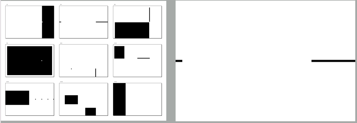
Fig 2.1.1 8 typographic systems_First Attempt (28/9/2024, week 2)
Fig 2.1.2 8 typographic systems_Second Attempt (28/9/2024, week 2)
Research
(23/9/2024)
Before starting the design, I do some research regarding the typographic
systems and punk culture.
I try to search for different designs that represent the application of
the each typographic systems
Fig 2.1.3 Reference (28/9/2024, week 2)
Punk culture:
Puck imagery took varies of methods to showcase its characteristic,
such as simple, dirty and aggressive messages. Collage and cut-and
paste designs works are largely used in Punk style design.
After discovering some classic punk music album, I decided to go
with the signiture "Punk Pink" as the main color used in the design.
Fig 2.1.4 London Calling (1979) by The Clash (28/9/2024, week 2)
Fig 2.1.5 Punk Flag (1977) by Wire (28/9/2024, week 2)
Progress
After finishing the text layout, I try to explore some elements that
can be used in the layout.
Fig 2.1.6 Design elements / decorations (28/9/2024, week 2)
-
Basics elements: Circle & Arrow (for visual guide)
-
Star shapes elements represent collage art.
-
Radial elements (Stroke type in InDesign)
-
Random shapes (Used in Random System)
1. Axial System
Fig 2.1.7 Axial System first attempt (25/9/2024, week 2)
Week 2 feedback (10/1/2024):
-
For the first one (most left) The right area is not aligned with the
axis. Avoid seperate the pages with 2 colors. It's not a good for
readability. Thrid one is a better design.
2. Radial System
Fig 2.1.8 Radial System first attempt (27/9/2024, week 2)
Week 2 feedback (10/1/2024):
3. Dilatational System
Fig 2.1.9 Dilatational System first attempt (27/9/2024, week 2)
Week 2 feedback (10/1/2024):
4. Random System
Fig 2.1.10 Random System first attempt (27/9/2024, week 2)
Week 2 feedback (10/1/2024):
-
Mr Vinod commented that there is too much graphic elements. Try
to reduce it.
5. Grid System
Fig 2.1.11 Grid System first attempt (27/9/2024 , week 2)
Week 2 feedback (10/1/2024):
-
Most left one is accepted, but the white "All Ripped Up" is not
nessesary.
6. Transitional System
Fig 2.1.12 Transitional System first attempt
(28/9/2024, week 2)
Week 2 feedback (10/1/2024):
- For the second one, the circular orbit is not needed.
7. Modular System
Fig 2.1.3 Modular System first attempt (27/9/2024, week 2)
Week 2 feedback (10/1/2024):
-
For the first one, align "Influence" with "U" of "PUNK",
alignment is important as it create coherence.
8. Bilateral System
Fig 2.1.4 Bilateral System first attempt (27/9/2024, week 2)
Week 2 feedback
(10/1/2024):
Final Submission: Exercise 1_Typographic
System
Fig 2.1.15 Final Axial System (JPEG) (3/10/2024, week 3)
Fig 2.1.16 Final Radial System (JPEG) (3/10/2024, week 3)
Fig 2.1.17 Final Dilatational System (JPEG) (3/10/2024, week 3)
Fig 2.1.18 Final Random System (JPEG) (3/10/2024, week 3)
Fig 2.1.19 Final Grid System (JPEG) (3/10/2024, week 3)
Fig 2.1.20 Final Transitional System (JPEG) (3/10/2024, week 3)
Fig 2.1.21 Final Modular System (JPEG) (3/10/2024, week 3)
Fig 2.1.22 Final Bilateral System (JPEG) (3/10/2024, week 3)
Fig 2.1.23 Final Submission_Exercise 1_Typographic System (PDF) (3/10/2024, week 3)
Fig 2.1.24 Final Submission_Exercise 1_Typographic System with Grid (PDF) (3/10/2024, week 3)
Exercise 2_Type & Play
We are instructed to an image of a man-made object or structures or
something from nature. Best to choice a subject that is repetitive and not
contain many different elements. We are recommended best to trace the
selected image.
Mr Vinod said that revolution of the extarcted letterform need to
dissemble from the reference. The reference is an aim but not the
destination. We need to extract out the characteristic from the reference
and retain the core characteristic of letters. We need to extarct minimum
of 5 letters.
Letterform extraction
Fig 2.2.1
Slime Mold, image by Anita
(27/9/2024, week 2)
Fig 2.2.2 Letter extraction 1 (27/9/2024, week 2)
Fig 2.2.3 Letter extraction 2 (1/10/2024, week 3)
Fig 2.2.4 Letter extraction 3 (1/10/2024, week 3)
For the letters, I arrange the letters to form the word
"FRAGXLE".
Slime mould has the characteristic of "irregular growth". I refer
these extracted letterforms to Bodoni (Poster Italic) font as I think it would be a good idea of fusing this
characteristics with the serif.
Fig 2.2.5 Extracted letterform adjustment (2/10/2024, week 3)
First Attempt
After the adjustment, I sketched out my first attempt design. I
think this version do bring out my rough ideas of irregular
growth.
Fig 2.2.6 First Attempt (3/10/2024, week 3)
Some problem analysis from the first attempt:
-
Letter spacing: Close or Spread ? Possibly can make the
letter connected by the serif. The spines make the
letter spacing looks iniconsistent.
-
Although "irregular" is the core idea, still need to
find a way to standardize the characteristic of
different letters.
- More rounded or spinky?
-
The readability is maintained, but the characteristic is
lost while zooming out.
Research

Second Attempt
After refering to the reference, this is my second
attempt.
I increase the letter spacing between the reference
letters to bring more space for the charcteristic to show
up. I manage to design 4 letters within the week.

Fig 2.2.10 Bodoni (Poster Italic)
(4/10/2024, week 3)
Fig 2.2.11 Characteristics (4/10/2024, week 3)
Fig 2.2.12 "F" digitization (4/10/2024, week 3)
Fig 2.2.13 "F, R, A, G" digitization (8/10/2024, week 3)
Thirs Attempt
Mr Vinod commented that the second attempt this
actually lost some characteristic. I should use the
extracted letter "A", "L" and "G" as benchmark.
After re-observe the image again, this is my thrid
attempt:
I change the letters to "F", "G", "A", "X" and "L" as
there are the extracted letters that show the
characteristic the most.
Fig 2.2.14 "F, G, A, X, L" digitization (10/10/2024, week 4)
Final Letterform
Lastly, I add more spines for decoration as I think it helps in fitting in the poster.
Fig 2.2.15 Comparison with reference font (Bodoni-Poster Italic) (10/10/2024, week 4)
Fig 2.2.16 Letters with baseline (10/10/2024, week 4)
Fig 2.2.17 Final letterform (10/10/2024, week 4)
Poster design
We need to design a movie poster (1024 x 1024) using
the letters. Same or similiar photo for the letter
extraction need to be used.
This is the image I used for the poster:
I choose the green-yellow as the main color of the
poster. I think it fits the natural color of slime
mold and give some horror feeling at the same
time. I manipulated the image into two toned and
add some noise effect.
Fig 2.2.19 Two-toned image & Noise
effect (10/10/2024, week 4)
Then, I try to fit the letters into the poster.
This is the part I struggle a lot as its hard to
find a balance that the image wouldn’t overshine
the letters.
Fig 2.2.20 Title placing (10/10/2024, week 4)
Fig 2.2.21 Movie Credit (10/10/2024, week 4)
Fig 2.2.22 Logos (10/10/2024, week 4)
I apply the gradient on it. I use dark
blue and yellow as they are complementary
colours. Besides, I add some stipple
pattern to add more variation on the
texture.
Fig 2.2.23 Gradient (10/10/2024, week 4)
Fig 2.2.24 Final
Poster_Task 1.2: Type & Play (13/10/2024, week 4)
Fig 2.2.25 Final Poster_Task 1.2: Type & Play_PDF (13/10/2024, week 4)
Progress
Fig 2.2.26 Type & Play Progression
(PDF) (13/10/2024, week 4)
*Exploration of different version
Another version just for fun. I want to test out is my design
sense on the letters will change when using different letters with
different meaning.
Fig 2.2.27 Exploration sketches (27/9/2024, week 3)
To retain the readability, my idea is make one side of the letters more
curvy and another side maintain straight. I think this can possibly
strengthen the contrast in the designs
I find some reference on curly font design.
Slime mould has the characteristic of "growth". I get some inspiration
from this reference. I think the idea of using blocks as guide in the
design is great. It allows the extension of the letters and
simultaneously retain the basic shapes of the letters.
FEEDBACK
Week 1: (No feedback)
Week 2:
General Feedback:
-
Generally, as a designer, you are not supposed to change the context
that are given by the clients. (There is different between communication
and design communication) If you really want to do it, a multiple
options need to be provided to clients.
- Be aware of technical apperrence and aesthetic at the same time.
-
Form follow finction: When we design a form, the form need to have
function and meaning. It is important to justify the designs.
-
Communicate clearly is the priority, be aware when outlined the text.
-
Reading rhythm is important, do not disrupt the reading rhythm if there
is no special meaning or function.
-
When doing axial system, do not tlit the angle with large angle
(suggested to be <45 degrees).
- Alignment is important in grid system.
Specific Feedback:
-
Axial: The right area is not aligned with the axis. Avoid seperate the
pages with 2 colors. It's not a good for readability.
- Radial: Good
- Dilatational: Good
-
Random: Too much graphical elements, but it does looks interesting.
-
Grid: Looks greedy, the white "All Ripped Up" is not neccesarry. But
overall looks good.
-
Modular: Align "Influence" with "U" of "PUNK", alignment is important as
it create coherence.
- Transitional: The circular orbit is not needed.
- Bilateral: Accepted.
Week 3:
General Feedback:
- Refine the shape to make it more consistent.
-
Once we understand the characteristic, we don't need to trace it out
anymore.
- There is lack of observation on the subject.
Specific Feedback:
-
The second extraction show more characteristic than the final
-
The letter "A", "L", "G" can be the benchmark for the letter.
- Retain the direction of the letters.
Week 4
General Feedback:
-
Try to create contrast between the letterform title and the caption. For
example, the title is serif font, use san serif font for the caption.
-
For the Task 2 wordmark, try to get feedback from your peers on
readability and legibility. Ideally, the workmark should be legible for
people that don't know the goal of it.
Specific Feedback:
REFLECTIONS
Experience
Overall, I think this task is a good sequel for what I have learn in the
Typography module. However, unlike the previous module, Advance Typography
module allow for much more freedoom and space for expression. This
shift is refreshing and challenging, as it encourages me to push the
boundaries of what I can achieve. I feel more confident in making decisions
that enhance both the aesthetics and functionality of my designs.
For the Type & Play exercise, I think I still have a big room of
improvement. One of the biggest challenges I’ve faced is being torn between
different ideas, which has made myself a bit overwhelming and couldn't make
decision effectively. Nevertheless, this is a good try for myself
in exploring different approach.
Observation
Looking back at my work from last semester, I can clearly see how my skills
and sensitivity on typography have evolved. My understanding of elements
like typeface selection, layout design, grid structure, and the use of white
space has deepened significantly.Tthe 8 typographic systems exercise is a
good verification.
Mr. Vinod gave a lot of valuable feedback regarding the design works and the
learning attitude. Each critique has been a stepping stone in my
development.
Findings
FURTHER READING
Fig 3.1
Grid System in Typography (1981)
Author: Josef Müller-Brockmann
(27/9/2024, week 3)
Construction of Type Area
The designer is well advised to make his small-scale sketches as accurate
as possible. A very common mistake is to sketch the lines of text
unrealistically, usually The lines are indicated too vaguely On conversion
into the 1 :1 format it may be subsequently found that the texts will not
fit into the size desired. The best solution is for the designer to draw
the typeface true to scale whenever he/she can.
The formal of the page and the size of the margins determine the size of
the type area.
Just as every problem is novol and different from others, so the grid
must be conceived afresh every time so as to meet requirements This
means that the designer must approach oach new problem with an open mind
and must soek to solve it by analysing it objectively
Ensure small-scale sketches are accurate to avoid fitting issues when
scaled to 1:1 format.
Avoid drawing text lines too vaguely; sketch typefaces as close to
scale as possible.
Page format and margin size determine the type area.
Each design grid must be uniquely conceived to meet specific project
requirements.
Approach every new design problem with an open mind and objective
analysis.
Treat each design challenge as novel, requiring a tailored
solution.
When visual information mainly consists of text, the type area is
determined by the printed format.
Consider the depth and width of the type area, the size of the
typeface, text volume, and the number of available pages.


fire emoji
ReplyDeletepeepohappy.emoji
Delete